
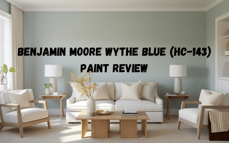
Benjamin Moore Wythe Blue (HC-143) is a soft, calming color that can change the look and feel of any space.
Its unique combination of green, gray, and aqua-blue undertones creates a serene and peaceful atmosphere in your home.
If you’re updating a room or selecting a new color for a fresh start, Wythe Blue offers a flexible and lasting option.
This color works well in any part of the house, from living rooms to kitchens, and it pairs easily with many different design styles.
In this guide, we’ll look at why Wythe Blue is such a popular choice for homeowners and how it can improve your space.
Wythe Blue: Color Details
Undertones
Wythe Blue has a unique mix of green, gray, and aqua-blue undertones. These soft shades change depending on the light in a room, giving the color a flexible look.
The color can look different at different times of the day or with different lighting, which makes it a great choice for spaces that get a lot of natural light or need extra lighting.
This shifting quality helps keep the space feeling fresh, no matter the time of day or how much light is in the room.
Light Reflectance Value (LRV)
Wythe Blue’s Light Reflection Value (LRV) is 48.11. This number shows how much light a color reflects.
A higher number means the color reflects more light, and a lower number means it reflects less.
With an LRV of 48.11, Wythe Blue is in the middle. It absorbs some light, giving rooms a soft, balanced glow.
This makes it a great choice for spaces where you want a calm feel without being too bright or too dark.
Comparison with Similar Colors
Wythe Blue is often compared to other popular Benjamin Moore blues, like Palladian Blue, Woodlawn Blue, and Williamsburg Wythe Blue.
While all of these colors are similar, Wythe Blue stands out because of its smooth mix of blue and green.
- Palladian Blue is lighter and cooler, often looking more turquoise, while Wythe Blue is warmer and softer because of its green undertones.
- Woodlawn Blue is a soft blue, too, but it has more gray in it, making it feel more muted compared to Wythe Blue’s fresher look.
- Williamsburg Wythe Blue is similar in color but a little darker and bolder. Wythe Blue feels gentler and works well in many different spaces.
Wythe Blue’s mix of blue, green, and gray makes it a very flexible color that can fit with many different styles.
It works well in both bright and dimly lit rooms and pairs easily with other colors and materials in a home.
Best Uses for Wythe Blue in Interior Design
Its calming, soft tones create a peaceful atmosphere while enhancing the overall design.
When used on walls, furniture, or accents, Wythe Blue can change any room into a serene and inviting space.
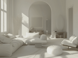
Living Rooms and Bedrooms

Wythe Blue creates a tranquil, relaxing environment. It works especially well in living rooms and bedrooms, making them feel calm and inviting.
It’s a great choice for creating a peaceful retreat at home.
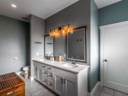
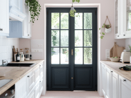
Kitchens and Bathrooms

This color also shines in kitchens and bathrooms. Its soft tone makes these functional spaces feel open and airy while still being warm and welcoming.
Accent Walls and Trim

Wythe Blue can add depth to a room when used on accent walls or trim. It draws attention to architectural features and brings a sophisticated look without being overpowering.
Furniture and Decor

You can also incorporate Wythe Blue through furniture and accessories, such as throw pillows, rugs, and curtains.
This helps bring the color into the room without overwhelming the space.
Wythe Blue Under Different Lighting

Day vs. Night
Wythe Blue can look quite different depending on the time of day. During the day, when natural sunlight is streaming in, the color tends to appear lighter and brighter.
This is because natural light helps bring out the blue-green undertones, making the color feel fresh and airy.
In the evening, when artificial lighting takes over, Wythe Blue can shift to a softer, more muted tone.
The artificial light can make the color look warmer and less vibrant, giving the room a cozier, more relaxed atmosphere.
This change in appearance can create a different mood throughout the day, allowing the color to adapt to both bright, active moments and peaceful, quiet times at night.
Tips for Enhancing the Color
To get the most out of Wythe Blue, consider the lighting in your space. The right lighting can bring out the best in this versatile color.
-
Use warm light bulbs: Warm light bulbs are a great option for creating a cozy and inviting atmosphere. They add a soft glow that helps bring out the color’s green and gray undertones, making Wythe Blue feel calm and welcoming.
-
Cool light bulbs: Cool light bulbs work well to highlight the blue tones of Wythe Blue. They bring out the color’s blue undertones, giving the space a fresher, cleaner feel. This is a good option if you want the color to appear more vibrant and dynamic.
-
Experiment with different lighting: Since Wythe Blue can change with different light sources, don’t be afraid to play around with how the color looks under various lighting conditions. Try different bulb types or adjust the light in the room throughout the day to find the perfect balance for your space.
The Best Finishes for Wythe Blue Paint
| Finish Type | Appearance | Best For | Durability |
|---|---|---|---|
| Matte | Smooth, flat look with a soft, muted color | Subtle, calming atmosphere in low-traffic areas | Low durability, harder to clean |
| Satin | Slight shine that adds brightness and dimension | High-traffic areas, it adds dimension to walls | Medium durability, easier to clean |
| Glossy | High shine that makes color pop, but highlights imperfections | Accent pieces, trim, or areas with less traffic | High durability, easy to clean but shows imperfections |
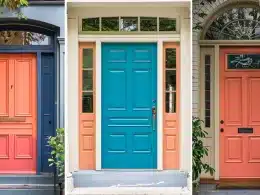
Wythe Blue in Exterior Design

Outdoor Use
Wythe Blue isn’t just for indoor spaces; it can be used on the exterior of your home too. Consider using it for doors, shutters, or patios to create a welcoming, calming vibe outside.
Weather Considerations
When using Wythe Blue for exterior projects, it’s important to choose outdoor-grade paint to ensure it withstands the elements.
The color’s soft tone works well in various climates, but be sure the paint is formulated to resist fading from sun exposure and moisture damage.
Conclusion
Wythe Blue is a versatile and calming color that can improve any space, from living rooms to bathrooms.
Its blend of green, gray, and aqua-blue undertones gives it a unique quality that changes with the light, making it perfect for creating a soothing environment.
Whether used on walls, furniture, or accents, Wythe Blue brings a peaceful touch to your home. If you’re ready to refresh your space, consider testing it.
Paint a room or add accents to see how this color can improve the look and feel of your home.
Don’t forget to check out other blogs on our website for more home design inspiration and ideas!