Choosing white paint sounds easy—until you’re staring at two shades that look almost the same.
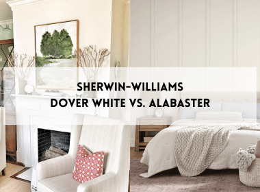
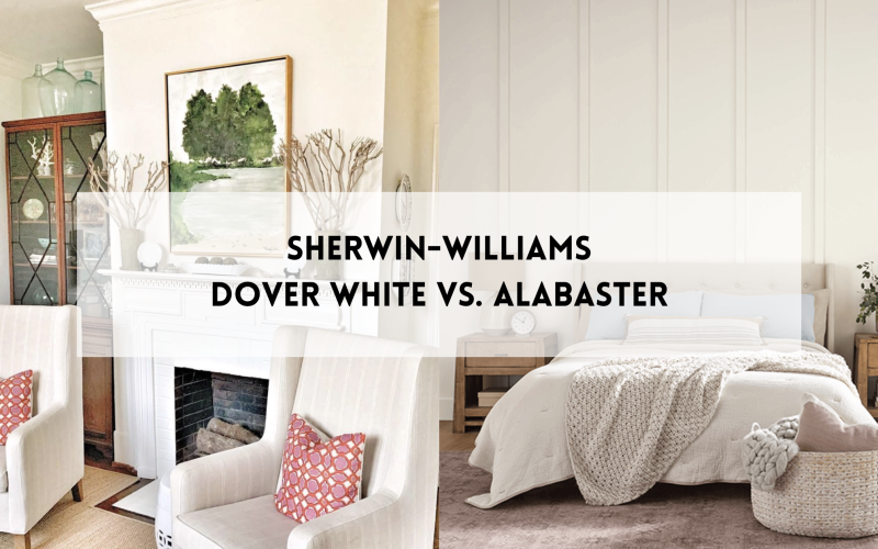
Dover White (SW 6385) and Alabaster (SW 7008)are two of the most popular soft whites from Sherwin-Williams. At first glance, they seem similar. But once on your walls, the differences are clear—and they can change the entire feel of a room.
This post breaks it all down in simple terms. You’ll learn how each shade looks in different lighting, which one better fits your style, and when to use one over the other.
If you’ve been stuck trying to pick between these two, you’re in the right place. Keep reading to avoid paint regrets and choose the white that actually works in your space.
Quick Look: Dover White vs Alabaster
Before we get into the details, here’s a quick side-by-side look to help you see the key differences.
| Feature | Dover White | Alabaster |
|---|---|---|
| Undertones | Creamy yellow | Soft beige/off-white |
| Warm or Cool | Warm | Slightly warm, neutral feel |
| LRV (Light Reflectance) | ~83 | ~82 |
| Popular Pairings | White trim, warm wood floors | Warm or cool whites, soft grays |
This table gives you a sense of how each color behaves. But once it’s on your walls, there’s a lot more to know.
Let’s take a closer look at what makes Dover White (SW 6385) and Alabaster (SW 7008) so different in real homes.
Dover White: Undertones and Mood

Dover White has rich, creamy yellow undertones that give it a soft, warm feel. It’s not a bright or cool white—it leans more toward a warm, creamy, cozy look.
This warmth makes it a great choice for spaces that need a little comfort. It brings a relaxed, lived-in vibe that works well in traditional, cottage, or farmhouse-style homes.
In rooms with cooler light, like north-facing spaces, Dover White can help add warmth and balance the space. It keeps things from looking too flat or gray.
But in bright sunlight or under strong artificial light, the yellow in Dover White can show up more. That’s something to think about if you’re aiming for a more neutral or modern look.
Pros of Using Dover White
- Adds a warm, cozy feel to any room
- Makes big spaces feel more comfortable
- Looks great with warm wood floors and cabinets
- Feels soft and welcoming without needing bold color
- Good choice for farmhouse or traditional styles
Cons of Using Dover White
- It can look too yellow in bright sunlight
- Doesn’t match well with cool colors like gray or blue
- Might feel too old-fashioned for modern or minimal homes
Alabaster: Undertones and Mood

Alabaster has a soft white base with subtle beige and gray mixed in. It’s not too warm and not too cool, which makes it feel calm and easy to use.
This balance helps it fit in a lot of different styles—especially in homes with modern, farmhouse, or simple designs.
In open or bright spaces, Alabaster keeps things feeling fresh and clean without looking cold. It gives the room a soft glow that’s easy on the eyes.
Because it’s not too bold, it works well as both a wall color and a trim color.
Pros of Using Alabaster
- Fits with many styles like farmhouse, modern, and minimal
- Works in both bright and low-light rooms
- Soft enough for walls, strong enough for trim or cabinets
- Makes a space feel clean without being too white
- Easy to match with wood, metal, or fabric finishes
Cons of Using Alabaster
- Can feel a little flat in rooms with very little light
- May not pop next to other soft whites or beige tones
- Doesn’t give strong contrast in monochrome color schemes
Dover White vs Alabaster: Side-by-Side Comparison
| Category | Dover White | Alabaster |
|---|---|---|
| Natural Light | May lean toward yellow or golden, especially in sunny rooms | Stays soft and creamy without strong color shifts |
| Artificial Light | Warms up more, yellow tones become stronger | Stays closer to soft, true white |
| Bedrooms | Feels cozy and warm | Feels light, calm, and airy |
| Living Rooms | Adds warmth and comfort | Offers a clean and fresh look |
| Kitchens | Great for walls in warm, traditional kitchens | Ideal for cabinets or modern, farmhouse-style kitchens |
| Exteriors | It may look too yellow in bright sunlight | Holds its tone better and looks balanced outdoors |
| Trim Pairing | Pops with crisp white trim | It can be used as both a wall and trim color |
| Floor Pairing | Works well with oak, walnut, terracotta, and other warm tones | Matches light or dark wood floors easily |
| Accent Colors | Best with warm colors like tan, rust, or cream | Goes well with grays, soft blues, and even black |
Dover White Pairing Ideas
1. Dover White with Extra White

When you pair Dover White with Extra White (SW 7006), the resulting combo gives a clean, sharp contrast. The Extra White trim keeps Dover White from feeling too yellow.
Use this for: Walls + trim, or cabinets + walls
2. Dover White with Tony Taupe

Tony Taupe (SW 7038) brings out the creamy warmth in Dover White. Together, they feel relaxed and earthy.
Use this for: Cozy living rooms or bedrooms
3. Dover White with Clary Sage

Clary Sage (SW 6178) pairs beautifully with Dover White. It balances the warmth and adds a touch of nature.
Use this for: Traditional kitchens or entryways
4. Dover White with Rookwood Terra Cotta

This combo feels rustic and bold. Rookwood Terra Cotta (SW 2803) adds energy, while Dover White keeps it grounded.
Use this for: Dining rooms or feature walls
5. Dover White with Warm Beige

Using Warm Beige (SW 0035) with Dover White gives a very soft, low-contrast look. Great if you want something warm and seamless.
Use this for: Whole-room color schemes or layered neutrals
Alabaster Pairing Ideas
1. Alabaster with Snowbound

This pairing offers a soft contrast. Alabaster feels warmer, while Snowbound (SW 7004) adds a cooler, clean-trim look.
Use this for: Walls with white trim or cabinets
2. Alabaster with Light French Gray

Light French Gray (0055) tones down the warmth in Alabaster. Together, they feel calm and modern without being too cold.
Use this for: Bedrooms, bathrooms, or neutral living rooms
3. Alabaster with Dustblu

Dustblu (SW 9161) adds a cool, peaceful vibe to the space. Alabaster keeps it light and airy without going too white.
Use this for: Coastal or farmhouse styles
4. Alabaster with Sage

Sage (SW 2860) brings a natural, muted green to the mix. It plays nicely with the beige in Alabaster and keeps things soft and organic.
Use this for: Entryways, kitchens, or relaxing workspaces
5. Alabaster with Charcoal

Charcoal (SW 3063) gives a bold contrast to Alabaster. This combo feels clean, modern, and a bit dramatic.
Use this for: Cabinetry, islands, or trim
11. Alabaster with Naval

Naval (SW 6244) adds richness and depth without clashing. Alabaster keeps the space from feeling too heavy or dark.
Use this for: Kitchen cabinets, bathrooms, or accent walls
Dover White vs. Alabaster: Real Home Examples
Paint chips can only tell you so much. Seeing these colors in real homes makes a big difference.
Below are a few common spaces where Dover White and Alabaster really show their character.
Bedrooms

Dover White brings warmth into the bedroom, especially with wood furniture and soft lighting. It works well in farmhouse and vintage-style setups.
Alabaster feels calm and gentle. It pairs well with light bedding, soft grays, and a clean, relaxed look.
Living Rooms

Dover White gives a living room a cozy, welcoming feel. It blends nicely with warm woods, layered textures, and classic details.
Alabaster feels bright and airy. It’s great for open spaces with lots of natural light and light-colored furniture.
Bathrooms

Dover White looks vintage when paired with natural stone or warm tile. It works well in bathrooms with character.
Alabaster keeps things feeling open and bright. It pairs well with black fixtures, light tile, and soft accents.
Exteriors

Outside, Dover White can take on a golden tone in full sunlight. It works best when paired with darker trim or earthy details.
Alabaster holds its soft color well outdoors. It looks clean and classic on siding, brick, or trim.
Tips for Choosing the Right One

- Test large swatcheson more than one wall. Different walls can show the color differently, especially with changing light.
- Check the color at different times of day. Look at it in the morning, afternoon, and evening to see how it changes.
- Compare it with your furniture and floors. Some whites may clash with cool grays or warm woods—see how it looks with what you already have.
- Think about the mood you want. If you want cozy and warm, go with Dover White. If you like soft and clean, Alabaster may be the better pick.
- If you’re still unsure, try both. Paint small sections or sample boards and live with them for a few days before making a final choice.
Conclusion
Dover White and Alabaster are both great choices, but they offer different vibes.
Dover White is warm and creamy—great for cozy, classic spaces with lots of light- while Alabaster is soft, neutral, and clean—perfect for modern, calm rooms that need flexibility.
The best way to decide? Test both in your own space.
Look at them in natural and artificial light, and see how they work with your floors and furniture.
Still not sure which one feels right?
Scroll back up to the real room examples for a second look, or check out more paint guides and color tips on our website.
We’ve got plenty more ideas to help you pick the perfect shade.

