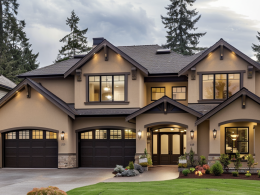
Choosing the right paint colors can transform your home into a haven. Whether you’re seeking calm in your bedroom or vibrance in your living room, color holds the power to set the perfect vibe.
You’ll find everything you need here – tips on how colors affect moods, and how to mix them effectively.
Let’s explore together and discover what shades best suit each room’s energy.
Psychological Impact of Color in Home Design
Color isn’t just decoration. It affects how you feel and think. Bright colors like yellow can make a kitchen feel lively, while blues often create a serene atmosphere in bathrooms.
You might not realize it, but the colors you choose influence your daily mood and behavior.
For example, painting your office green could boost productivity because it’s both refreshing and calming.
When picking paint, consider what feeling you want each room to evoke. Do some research on color psychology to match shades with your desired ambiance.
How to Use a Color Wheel for Perfect Harmony
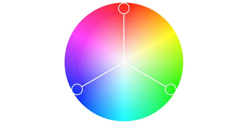
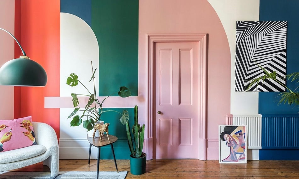
Have you ever wondered why some color combinations just look right? A color wheel holds the answer by showing complementary hues that enhance each other perfectly. This simple tool is essential for creating harmonious interiors without fussing over mismatched tones.
Start by picking a base color that sets the main tone for the room – maybe something bold or neutral depending on your style preference. Then, use adjacent or opposite colors from the wheel as accents for balance and depth.
The ‘Color Wheel – Color Theory, Harmony and Calculator’ is a great color mixing guide that provides an easy way to visualize these pairings before making decisions.
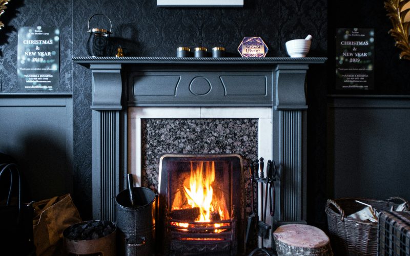
Choosing Warm Tones for a Cozy Atmosphere
Warm tones such as reds, oranges, and yellows infuse spaces with energy and warmth instantly creating inviting environments where people love spending time together.
Consider using deep reds in dining rooms; they encourage appetite while fostering connection among guests.
Or maybe golden yellows in living areas – they bring cheerfulness reminiscent of sunny days indoors even during gloomy weather outside.
Consider adding warm shades to spaces designed for relaxation and socializing. These colors ensure a cozy atmosphere, making the area enjoyable year-round.
The Science Behind Cool Colors And Calm Spaces
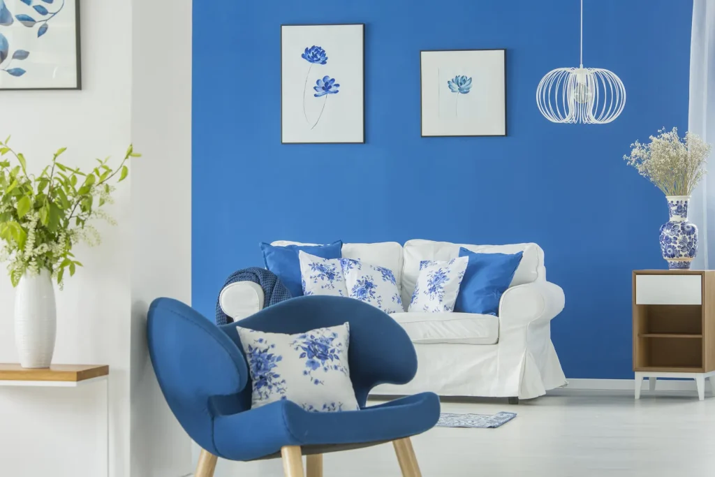
Cool colors like blues, greens, and purples bring tranquility. They transform rooms into restful sanctuaries perfect for winding down after hectic days.
Light blue bedrooms promote better sleep by reducing anxiety. Green offices foster creativity and focus, aiding concentration during long work sessions.
Darker cool shades evoke dramatic moods. Lighter counterparts maintain airy openness while inviting calmness and peace in abundance.
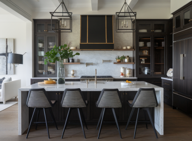
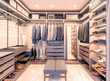
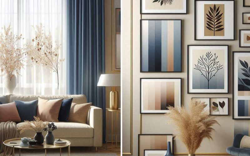
Neutral Shades: Balancing Bold Accents with Subtle Backdrops
Neutral shades offer versatility and sophistication. Think soft beiges, grays, or creamy whites as your backdrop. They create a calming canvas that allows bold accents to pop without overwhelming the space.
You can add colorful pillows, rugs, or artwork to inject personality. These touches stand out beautifully against neutral walls.
In a living room with beige walls, for example, consider navy blue curtains and gold-framed pictures for an elegant contrast.
Neutrals provide balance while keeping the room cohesive and timeless – perfect if you like switching up decor often without repainting each time.
Practical Tips for Mixing and Matching Colors
Mixing colors can seem daunting but becomes easy once you get the hang of it! Here are some practical tips:
Ombre Walls: Start light at the top, fading into a deeper shade at the bottom. This technique creates a stunning gradient effect that adds depth and visual interest to any room. Perfect for creating a focal point without being overwhelming.
Sponging Technique: Layer multiple colors using a sponge to add texture and dimension. This method allows you to blend hues subtly, giving walls an almost cloud-like appearance – great for feature walls or adding character to smaller spaces.
Stripes: Alternate between two contrasting colors on accent walls for bold statements or softer contrasts with similar shades. Stripes can elongate your space vertically or horizontally depending on their orientation, making rooms feel more spacious or cozy.
Color Washing: Apply diluted paint over a base coat to create depth with translucent layers. Ideal for those who prefer softer finishes; this technique brings an antique charm that works well in living areas and bedrooms alike.
Rag Rolling: Roll a rag dipped in glaze over the painted surface for rustic effects reminiscent of old-world plastered walls. It’s perfect if you’re aiming for an earthy, textured look that evokes comfort and timelessness.
Experiment with these techniques to find what suits your style best!
Incorporating Seasonal Trends into Your Home Decor
Seasonal trends offer fresh ideas for your home’s color palette. In spring, pastels bring renewal. Summer calls for vibrant, sunny shades. Autumn introduces warm earth tones while winter embraces cozy and cool hues.
Embrace these changes to keep your space dynamic and inviting all year round!