


Sherwin-Williams Alabaster (SW 7008) is one of the most popular neutral shades in interior design. Its soft, creamy tone adds warmth to any space.
Alabaster isn’t just a color; it’s a helpful tool that works well in many rooms, from cozy living areas to modern kitchens.
What makes Alabaster special are its undertones. These subtle colors can change how the color looks depending on the light.
This makes Alabaster very flexible. Whether you want to create a bright, open feel or a warm, inviting atmosphere, Alabaster’s undertones help set the right mood.
Keep reading to see how this color can work in your home.
What are Sherwin-Williams Alabaster’s Undertones?

The Warmth of Alabaster
Alabaster’s soft, yellow-beige warmth gives it a cozy, inviting feel. This warmth is subtle, making the color rich without being overpowering.
It differs from cooler whites, which can appear sharp or stark in a room. Alabaster’s warmth softens the space, creating a welcoming atmosphere.
The color’s Light Reflectance Value (LRV) is 82, which means it reflects a good amount of light. This helps create an airy, open feel, making it suitable for various spaces.
Alabaster’s tone adapts to different lighting conditions. It can appear lighter in bright spaces or richer in dimmer ones, offering versatility.
Common Misconceptions
There’s often confusion between cream, yellow, and beige undertones. Alabaster has a touch of yellow, but it’s not as yellow as some creams.
It’s a neutral off-white with a warm, soft tone, making it feel comfortable without being too bold.
Alabaster is different from pure whites, with cooler undertones. These whites can feel cold, while Alabaster adds warmth and comfort.
Pros of Using Alabaster
- Fits with many styles like farmhouse, modern, and minimal
- Works in both bright and low-light rooms
- Soft enough for walls, strong enough for trim or cabinets
- Makes a space feel clean without being too white
- Easy to match with wood, metal, or fabric finishes
Cons of Using Alabaster
- Can feel a little flat in rooms with very little light
- May not pop next to other soft whites or beige tones
- Doesn’t give strong contrast in monochrome color schemes
Alabaster in Different Lighting

Alabaster’s appearance can change depending on the lighting in a room. It reacts to both natural and artificial light, making it a versatile choice for any space.
The way it looks in different lighting conditions can significantly impact a room’s mood.
How Alabaster Changes in Natural Light
In well-lit spaces, Alabaster appears as a soft white with a gentle warmth. It brightens up a room without being too harsh.
The light reflects off its warm undertones, giving the room a fresh, airy feel. This makes it a great choice for spaces that get plenty of natural light.
Alabaster in Low Light
In dimmer lighting, Alabaster’s warmth becomes more noticeable. The soft yellow-beige undertones create a cozy and inviting atmosphere.
This makes it perfect for rooms like bedrooms or living areas where you want to feel relaxed and comfortable. The color adapts, giving off a soothing vibe even without much light.
Best Rooms for Alabaster
Alabaster’s warm, soft undertones make it a great choice for many rooms in your home.
Whether you want a cozy, inviting feel or a clean, neutral base, Alabaster works well in both modern and traditional spaces.
Its versatility allows it to enhance different styles and materials in a variety of rooms.
Living Rooms and Bedrooms

Alabaster’s creamy undertones create a welcoming and relaxing environment in living rooms and bedrooms.
It offers a sense of calm and comfort, perfect for spaces where you want to unwind.
It pairs well with soft furniture and light fixtures in living rooms, adding warmth without overpowering the space.
With its soothing tones, it creates a peaceful retreat in bedrooms.
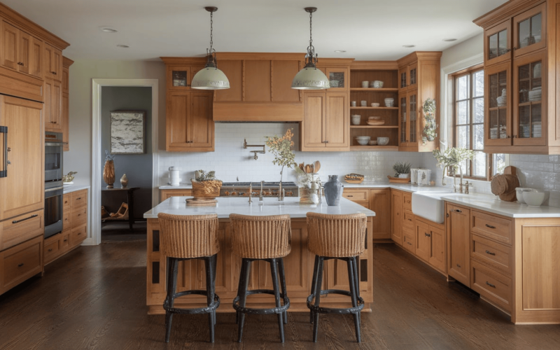
Kitchens and Bathrooms

Alabaster works well in kitchens and bathrooms, providing soft neutrals that pair beautifully with various materials like wood, tile, and metals.
In kitchens, it complements countertops, cabinets, and backsplashes, helping to keep the space feeling fresh and bright.
In bathrooms, it creates a clean, spa-like atmosphere that feels open and airy.
Alabaster vs. Other Popular Whites
When comparing Alabaster to other popular whites, it’s important to consider the subtle undertones that change a room’s overall feel.
Each white has its own unique warmth or coolness, which can dramatically change a space’s mood.
Comparison with Pure White

Although Alabaster (SW 7008) and Pure White (SW 7005) are both whites, they create very different atmospheres in a room.
-
Alabaster has subtle yellow-beige undertones, giving it a warm, soft feel that makes a space feel more inviting and cozy. This warmth adds character without overwhelming the room.
-
Pure White, on the other hand, is a more neutral white with cooler undertones, giving it a crisper, cleaner appearance. It’s great for modern or minimalist spaces that need a sharp, bright finish.
In terms of mood, Alabaster tends to create a softer, more relaxed environment, while Pure White offers a more fresh and modern look, often feeling a bit cooler or more sterile.
Comparison with Warm Whites

Alabaster is unique compared to other warm whites, such as Creamy (SW 7012) and Antique White (SW 6119).
-
Creamy (SW 7012) is a deeper, warmer white with a stronger yellow undertone, giving it a richer, more golden feel. This makes Creamy ideal for spaces where you want a bolder warmth, like kitchens or dining rooms.
-
Antique White (SW 6119) has a more pronounced beige undertone than Alabaster’s subtle warmth. It feels even more traditional, often used in spaces that call for an old-world, classic charm.
Alabaster, with its soft and balanced warmth, strikes a middle ground between these two.
It doesn’t have the deep yellow tone of Creamy or the heavier beige undertone of Antique White, making it perfect for creating a warm, neutral backdrop without feeling too bold or heavy.
Pairing Alabaster with Other Colors
The right color combinations can bring out the best in Alabaster, making your space feel balanced and stylish.
Alabaster with Naval

Sherwin-Williams Naval (SW 6244) is a rich navy blue that creates a bold contrast with Alabaster. This deep color brings sophistication and depth to a space.
Alabaster with Repose Gray

Repose Gray (SW 7015) is a soft, warm gray that works well with Alabaster’s undertones. It creates a calm, balanced look, perfect for modern or traditional designs.
Alabaster with Evergreen Fog

Evergreen Fog (SW 9130) is a muted green with blue undertones that pairs beautifully with Alabaster. Its earthy vibe adds richness and tranquility.
Alabaster with Sea Salt

Sea Salt (SW 6204) is a soft, muted green-blue that complements Alabaster’s warmth, adding a touch of freshness. This combination is ideal for creating a serene, spa-like atmosphere.
Alabaster with Iron Ore

Iron Ore (SW 7069) is a dark charcoal that contrasts nicely with Alabaster’s light warmth. It’s perfect for adding drama and depth to a room, creating a modern, edgy look.
How to Test Alabaster in Your Space
Before committing to Alabaster, it’s essential to test how it looks in your space.
Colors can appear differently based on the lighting, time of day, and surrounding elements like furniture or decor.
Testing helps ensure that Alabaster complements your room’s natural light and other design elements.
How to Test Alabaster
- Apply swatches to different walls, doors, or surfaces in the room.
- Choose multiple locations that receive both natural and artificial light to see how the color changes.
- Observe throughout the day as lighting shifts to see how Alabaster looks in different conditions.
- Check with surrounding elements, like furniture and decor, to ensure the color complements the room’s style.
- Consider the mood at different times of day—Alabaster may look softer or warmer in certain lights, helping you decide if it works for the space.
Conclusion
Alabaster is a flexible and classic color that works well in different lighting and room styles, making it a great choice for any home.
Its soft, warm undertones help create a cozy and welcoming feel, whether the space is bright or dim. From living rooms to kitchens, Alabaster adds a beautiful touch to any room.
To see how it looks in your home, try testing swatches in different areas. Please pay attention to how the color changes throughout the day and how it blends with your furniture and decor.
This will help you decide if Alabaster is the right choice for your space and create a warm, balanced atmosphere.
For more paint guides and home design tips, check out other blogs on our website. Get inspired and make your space shine!