
Picking the right paint color can be tricky. You’ve probably heard about Agreeable Gray, one of the most popular Sherwin-Williams gray colors.
It’s a go-to choice for many homeowners, but is it always the best option? Sometimes, this color might not work as well as you’d hope.
This post will help you determine when Agreeable Gray might not be the best choice for your space. It will show situations where this popular color could fail.
You’ll learn about lighting conditions, color combinations, and room types that might not play well with Agreeable Gray.
By the end, you’ll know exactly when to use this color and when to look for other options.
1. Avoid in Low Natural Light
Low Light Issues
Hey there! Let’s discuss Agreeable Gray in rooms that don’t get much sunlight. You might be surprised to learn that this popular color can be tricky in certain spaces.
Agreeable Gray can look slightly off in rooms with low natural light. It might appear “fleshy” or dull, which isn’t what we aim for. This often happens in north-facing rooms or basements without windows.
The lack of light doesn’t let the color show its true potential.
Impact on Room Aesthetics
Now, picture this: You’ve painted your room Agreeable Gray, but instead of the warm, cozy feel you wanted, it looks flat and uninviting.
That’s not fun at all! This color can make a room feel dingy or even gloomy in low-light conditions.
Basements painted Agreeable Gray can look more like a cloudy day than a cozy retreat.
The walls try hiding in the shadows instead of brightening up the space.
2. Conflicting Undertones
Cool Gray Undertones
Agreeable Gray has a warm undertone. But if you pair it with cool grays with violet undertones, like Repose Gray, things can get messy.
It’s like trying to mix oil and water – they don’t want to blend!
When you put these colors side by side, they can make each other look worse.
Instead of a smooth, cohesive look, you might end up with a space that feels off-balance or just plain odd.
Examples and Visual Clashes
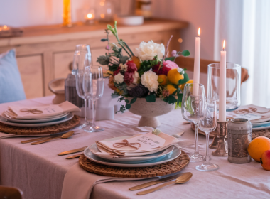
You’ve painted your living room walls Agreeable Gray and decided to add some Repose Gray accents. But instead of a nice contrast, the colors fight each other.
The Agreeable Gray might suddenly look too yellow, while the Repose Gray appears overly purple.
A kitchen with Agreeable Gray cabinets and cooler gray walls demonstrated an unexpected clash.
The intended subtle contrast instead looked like two mismatched color schemes, highlighting Agreeable Gray’s sensitivity to surrounding colors and lighting.
3. Incompatible Color Combinations
Creamy Whites
When you put Agreeable Gray next to creamy whites, they speak different color languages.
The creamy whites can make Agreeable Gray look dull or dirty. Trust me, it’s not a great look.
Warm and Cool Tone Clashes
Agreeable Gray has warm and cool tones but doesn’t always play nice with other colors. Some warm tones can make it look too cool, while some cool tones can make it look too warm.
Pairing Agreeable Gray with a warm terracotta color resulted in an unexpected outcome.
The contrast made Agreeable Gray appear almost blue, detracting from the intended cozy atmosphere.
This combination highlighted how Agreeable Gray can shift dramatically against warmer hues.
Examples
Someone used Agreeable Gray with a cool blue accent wall in another case. The result?
The Agreeable Gray looked almost beige, while the blue looked harsh. It was like the colors were fighting each other instead of working together.
4. Artificial Lighting Challenges
Impact of Different Bulb Types
Artificial lighting can change how Agreeable Gray looks, and not always for the better.
Cool white LED bulbs can make Agreeable Gray look flat and lifeless.
It’s like the color loses all its charm. On the other hand, very warm bulbs can bring out too much of the beige undertones, making it look more tan than gray.
Fluorescent lighting is probably the worst offender. Under these lights, Agreeable Gray can look greenish or even a bit sickly. Not exactly the look you’re going for, right?
Tips for Mitigating Issues
So, what can you do if you’re stuck with tricky lighting?
Here’s a tip: try using warm white bulbs. They’re not too cool or warm– like Goldilocks’ “just right” porridge.
Consider going for a slightly cooler gray if you’re using Agreeable Gray in a room with lots of artificial light, like a basement or a windowless bathroom.
This can help balance out the warmth that some artificial lights bring out.
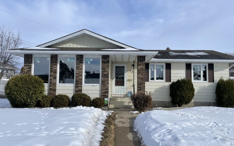
5. Special Cases: Exteriors
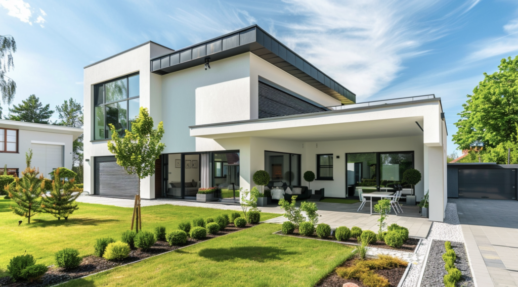
Outdoor Use
Agreeable Gray can look great on exteriors, but it’s not always a slam dunk. Outside, this color can appear much lighter than it does indoors. It might look almost white in bright sunlight.
This could be problematic in cases where a distinctly gray look is desired.
Homes, where owners wanted a soft gray exterior, have sometimes ended up with something that looked more like an off-white.
It’s not necessarily bad, just not what they expected.
Weather and Light Considerations
Agreeable Gray might wash out and lose its depth in areas with intense sunlight.
This is especially true if your home has many reflective surfaces nearby, like a pool or large windows. The reflected light can make the color look even lighter.
On cloudy days, Agreeable Gray might look great. But when the sun comes out, it could look completely different.
Also, consider your local weather. Agreeable Gray might not be the best choice in areas with heavy rain or humidity. It can show water stains more easily than darker colors.
Conclusion
So, what’s the takeaway from all this?
Agreeable Gray is a popular color for good reasons, but it’s not a one-size-fits-all solution. Before you grab that paintbrush, think about your room’s lighting, color scheme, and even your home’s exterior.
Agreeable Gray might not live up to its name in low light or with the wrong color pairings. Outdoors, it can be a whole different story.
But don’t let this discourage you! If you love Agreeable Gray, go for it – make sure it’s the right fit for your space.
Please test it out in different lights and with your existing décor.
Your perfect gray is out there, and it might just be Agreeable Gray in the right conditions.
Frequently Asked Questions
Does Agreeable Gray Fade Quickly on Exteriors?
Like most exterior paints, Agreeable Gray can fade over time. However, its light color means fading might be less noticeable than darker shades.
How Does Agreeable Gray Look with Brick Exteriors?
Agreeable Gray can complement some brick colors, but it depends on the brick’s undertones. Test it with your specific brick before painting.