

When painting a bedroom in two colors, many homeowners struggle to decide which wall should be darker.
This dilemma can make or break a space’s visual appeal.
Choosing the right placement for dark and light shades can dramatically change a room’s feel, affecting its perceived size and atmosphere.
Don’t worry – with the right approach, you can create a stunning two-tone look that enhances your room’s best features.
This guide will explain the key factors to consider when deciding which wall to paint darker in a two-color scheme.
We’ll explore how light, room dimensions, and focal points influence color placement and provide practical tips to help you make the best choice for your space.
Which Wall Should Be Darker?
1. Opposite Windows
Painting walls opposite windows with a cool, dark color can help manage light in overly bright rooms.
This technique absorbs extra sunlight, creating a more balanced and comfortable atmosphere.
It’s especially useful in spaces with intense natural light throughout the day.
For example, painting a deep navy or charcoal gray north wall in a south-facing room can help reduce glare and create a more soothing environment.
This approach adds depth to the room, making it feel more grounded and cozy.
2. Window Wall
To brighten a room, consider painting the window wall darker while keeping opposite walls lighter.
This approach reflects light into the space, making it more open and airy.
It’s an effective method for rooms that need a brightness boost.
The dark color around the windows can act as a frame, drawing attention to the view outside.
In a bedroom, for instance, a deep green on the window wall with lighter cream or beige on other walls can create a nature-inspired, refreshing atmosphere.
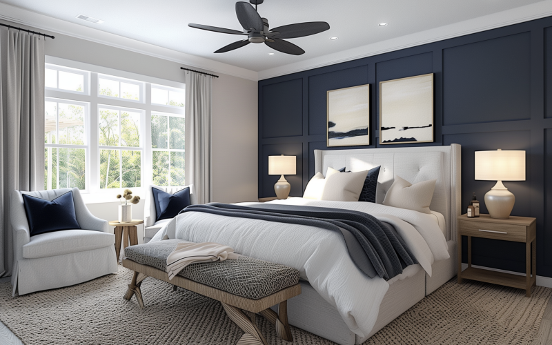
3. Focal Point
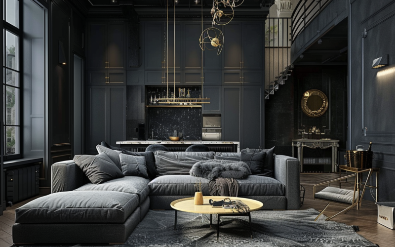
Using a dark color on one wall can create a striking focal point, drawing attention and adding depth to the room.
This technique can make a space feel more intimate and cozy, perfect for bedrooms or living areas where you want to create a sense of warmth and comfort.
A deep burgundy or rich chocolate brown accent wall behind a bed or sofa can anchor the room and provide a beautiful backdrop for artwork or decorative elements.
This approach works well in open-plan spaces to define different areas without physical barriers.
4. Short Walls
In wide rooms, painting short walls with darker colors can visually bring them closer, helping to balance the room’s proportions.
This trick can make elongated spaces more square and harmonious, improving the room’s overall feel.
For example, painting the shorter end walls in a rectangular living room in a deep terracotta or dark blue can create the illusion of a more balanced space.
This technique is particularly effective in rooms with high ceilings, making the space feel more intimate and less hollow.
Understanding Color Dynamics
Warm vs. Cool Colors
Warm dark colors, like deep reds or rich browns, tend to make walls appear closer, creating a snug atmosphere.
They can be particularly effective in large rooms where you want to create a more intimate feel.
Conversely, cool, dark colors such as deep blues or forest greens can make a space feel more expansive, as they tend to recede visually.
These colors work well in smaller rooms where you want to create an illusion of more space.
Choosing between warm and cool dark colors can significantly impact the room’s mood. Warm tones create a cozy, inviting feel, while cool tones can promote a sense of calm and serenity.
Light Reflection
Light colors have a higher light reflectance value, which bounces more light around the room. This property can make a space feel brighter and potentially larger.
Understanding this principle helps in balancing dark and light shades effectively.
In a room with limited natural light, using lighter colors on most walls and reserving darker shades for accents or smaller areas can help maximize the available light.
However, in a very large or bright room, using darker colors more liberally can help create a sense of balance and prevent the space from feeling too stark or overwhelming.
Combining Colors
When selecting colors, aim for combinations that complement each other. This creates a harmonious look that’s pleasing to the eye.
Consider using a color wheel to find complementary or analogous color schemes. For instance, pairing a deep navy with a soft coral can create a striking yet balanced look.
It is important to avoid clashing color pairings, as this can create visual discomfort and disrupt the room’s overall aesthetic.
Consider using different shades of the same color family for a foolproof combination when in doubt.
Remember that the undertones of your chosen colors should also be considered. Warm undertones generally work best with other warm colors; the same goes for cool undertones.
Common Mistakes to Avoid
1. Overuse of Dark Colors
Using too many dark colors, especially in small rooms, can make spaces feel cramped and confined. To avoid this:
- Use dark colors on just one wall as an accent
- Apply dark shades only below chair rails, keeping upper walls light
- Incorporate dark tones through furniture or décor instead of wall paint
The key is balance. Dark colors are powerful but should be used thoughtfully, particularly in compact areas.
2. Ignoring Natural Light
Failing to consider a room’s natural light when choosing dark colors can lead to unwelcoming spaces. Keep in mind:
- Rooms with limited light may feel gloomy with too many dark walls
- Observe how light changes throughout the day before deciding
- North-facing rooms might benefit from warmer dark tones rather than cool ones
- Test paint samples under various lighting conditions
By avoiding these mistakes, you can create a balanced space that effectively combines light and dark colors for a stylish, comfortable room.
Conclusion
Choosing which wall to paint darker in a two-color scheme can dramatically transform your room’s atmosphere.
By understanding how color placement affects light, space perception, and focal points, you can make informed decisions that enhance your room’s best features.
Consider natural light, room dimensions, and the overall mood you want to create.
Avoid common pitfalls like overusing dark colors in small spaces or ignoring the room’s lighting conditions.
Whether aiming to create a cozy bedroom or a spacious living area, strategically using dark and light colors can help you achieve your desired effect.
Ready to give your room a fresh look? Start by assessing your space and experimenting with color samples.
Don’t be afraid to get creative – your perfect two-tone room is just a paint job away!