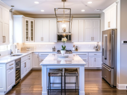

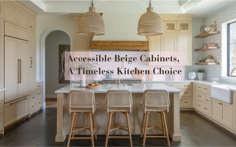
Sherwin-Williams’ Accessible Beige (SW 7036) is making waves in kitchen design.
This “greige” shade sits between beige and gray. It offers the perfect balance of warmth and neutrality.
Its subtle gray undertones prevent it from looking dated.
Accessible Beige works in both modern and traditional kitchens
It pairs beautifully with various countertops and hardware options.
This guide shows why designers love this balanced neutral. We’ll cover how it performs in different lighting.
You’ll learn ideal color pairings for your kitchen makeover.
Why Choose Accessible Beige for Your Cabinets?
Accessible Beige has become a popular choice for kitchen cabinets because it fits well in nearly any setting.
This color works nicely in both modern kitchens with clean lines and traditional spaces with more details.
It pairs well with white countertops for a fresh look or with wooden elements for added warmth.
Unlike pure white cabinets, which can feel cold, or dark colors, which may feel heavy, Accessible Beige provides a balanced option that keeps kitchens looking current without being too plain.
Neutral Yet Warm
The color adds a gentle warmth to kitchen spaces without being too strong. This is important since kitchens often serve as gathering spots in homes.
The soft tone of Accessible Beige helps create a comfortable setting where people naturally want to spend time.
It also works well as a background for other kitchen features, such as backsplashes, hardware, and appliances, allowing these elements to receive proper attention.
Many homeowners find that kitchens with Accessible Beige cabinets feel welcoming and lived in right away, making them a smart choice for kitchen updates.
Undertones
Accessible Beige has subtle gray undertones that keep it from looking too warm or yellow.
This makes it more stable than pure beiges, which can shift dramatically in different lighting.
The hint of gray gives the color depth without making it feel cold or stark, creating a soft, welcoming look on the cabinets.
Light Reflectance Value (LRV)
With an LRV of 58, Accessible Beige sits in the medium-light range of the brightness scale.
This number means it reflects a good amount of light into the room without being too bright or too dark.
This helps the space feel more open in smaller kitchens, while in larger areas, it adds just enough color to prevent walls or cabinets from looking blank.
Its moderate LRV also means it changes somewhat throughout the day as light shifts, but not so much that it seems like a completely different color.
Complementary Colors for Accessible Beige Cabinets
Choosing the right colors to pair with Accessible Beige cabinets can make your kitchen truly shine.
Here’s a quick guide to the best color combinations and hardware options:
Best Pairing Colors
| Color Category | Specific Colors | Notes |
|---|---|---|
| Whites | Alabaster (SW 7008), Pure White (SW 7005) | Creates a clean, bright look while keeping warmth |
| Grays | Repose Gray (SW 7015), Dorian Gray (SW 7017) | Enhances the gray undertones in Accessible Beige |
| Earthy Tones | Kilim Beige (SW 6106), Messenger Bag (SW 7740) | Builds a cohesive, warm color scheme |
| Blues | Sea Salt (SW 6204), Rainwashed (SW 6211) | It offers a soft contrast that feels calm |
| Greens | Retreat (SW 6207), Dried Thyme (SW 6186) | Adds a natural element that works well with the beige |
| Dark Accents | Urbane Bronze (SW 7048), Iron Ore (SW 7069) | Creates striking contrast for modern kitchens |
Hardware & Accents
| Hardware Type | Finish Options | Effect |
|---|---|---|
| Cabinet Pulls & Knobs | Matte Black, Oil-Rubbed Bronze | Creates sharp, modern contrast against the beige |
| Brushed Nickel, Chrome | It offers a subtle, timeless look. | |
| Brass, Gold | Adds warmth and a touch of luxury | |
| Faucets | Matte Black | Makes a bold statement |
| Brushed Gold | Complements the warmth in the beige | |
| Stainless Steel | It provides a clean, classic finish | |
| Natural Elements | Walnut, Oak, Maple | Wooden accents enhance the natural quality |
| Marble, Quartz | Stone elements create texture and interest. |
How Accessible Beige Works in Different Lighting
Paint colors can look quite different depending on the light they receive, and Accessible Beige is no exception.
This color shows its true versatility as lighting conditions change throughout the day and under various types of bulbs.
Natural Light Effects
Accessible Beige changes its appearance based on the direction of natural light in your home.
In north-facing rooms, its gray undertones become more visible, creating a cooler, more muted look.
South-facing spaces bring out its warmer side, making it appear more beige and cozy.
East-facing rooms see this color shift throughout the day – warmer in morning light and cooler in the afternoon.
In west-facing kitchens, Accessible Beige will look most subdued in the morning and warmest during the evening hours when the sun sets.
Artificial Lighting Impact
The type of bulbs you choose significantly affects how Accessible Beige appears.
Warm white bulbs (2700K-3000K) enhance the beige qualities and create a welcoming feel.
Cool white bulbs (3500K-4100K) highlight more of the gray undertones, offering balanced lighting that works well for cooking areas.
Daylight bulbs (5000K-6500K) make the color appear cooler and more gray-toned.
Under-cabinet LED lighting can add depth to the color by creating subtle shadows and highlights.
Lighting Tips for Accessible Beige Cabinets
For the best results with Accessible Beige cabinets, use layered lighting with a mix of overhead, task, and accent lights. Consider installing dimmers to adjust the brightness based on the time of day.
Bulbs in the 3000K-3500K range generally provide the most balanced appearance.
To maintain consistency, try maintaining similar light sources throughout the kitchen to keep the cabinet color uniform.
Real-Life Design Ideas: Accessible Beige in Action
Looking at how others have used Accessible Beige cabinets can help you picture this color in your own home.
Here are some standout examples of this versatile hue in various kitchen settings.
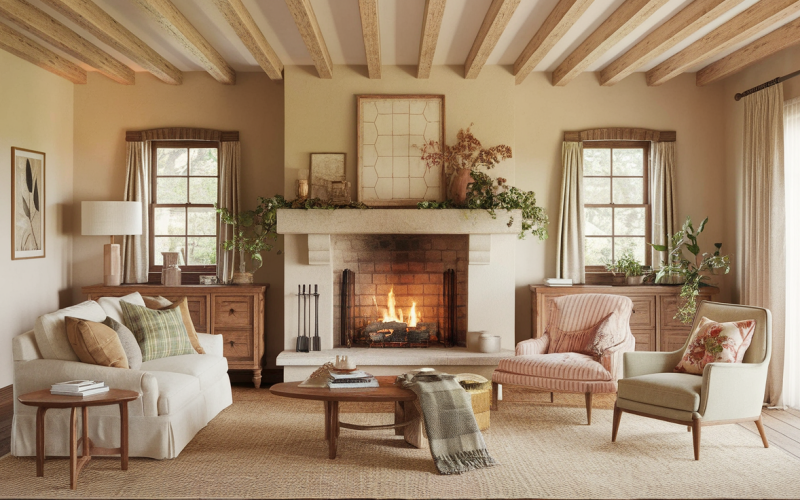
Modern Farmhouse Kitchen

In modern farmhouse kitchens, Accessible Beige cabinets create a warm backdrop for white subway tile backsplashes and dark hardware.
Many homeowners pair these cabinets with white quartz countertops and natural wood accents, such as open shelving or a butcher block island.
This combination gives the kitchen a lived-in yet fresh feel that works well with both metal and wooden accessories.
Classic Traditional Kitchen

When used on raised-panel cabinets with brass hardware, the color helps maintain a classic look without feeling dated.
Homeowners often match these cabinets with cream-colored stone countertops and neutral walls for a cohesive look that stays relevant year after year.
Contemporary Open Concept Space

In contemporary settings, Accessible Beige cabinets help connect open kitchen areas to living spaces.
The color acts as a gentle neutral that flows well into adjoining rooms painted in complementary tones.
Many designs use this cabinet color with waterfall islands, minimal hardware, and clean lines to create a current look that doesn’t feel cold.
Two-Tone Kitchen Design

Some of the most striking kitchens use Accessible Beige as part of a two-tone approach.
Upper cabinets in this color paired with darker lower cabinets (often in Urbane Bronze or Iron Ore) create visual interest and depth.
This style has become popular for adding character without using bright colors that might quickly go out of style.
Small Space Solution

In smaller kitchens, Accessible Beige cabinets help the space feel bigger while adding more personality than plain white.
Photos from real homes show how this color can make compact kitchens feel both cozy and spacious, especially when paired with light countertops and good lighting.
Based on examples from homes featured in design blogs and social media, Accessible Beige cabinets work exceptionally well with:
- White marble or quartz countertops
- Black matte fixtures and hardware
- Natural wood floors
- Subway tile in white or light gray
- Stainless steel appliances
- Green or blue accent colors
Pros and Cons of Accessible Beige for Kitchen Cabinets
Pros
- Works with many design styles, from traditional to modern
- It has staying power, unlike trendy colors
- It hides fingerprints and small marks better than white cabinets
- Pairs easily with most countertops and backsplashes
- It provides a good base for changing accent colors
Cons
- May feel too safe or lacking character for some tastes
- It can look dull in kitchens with minimal natural light
- It appears more gray than expected in north-facing rooms
- Needs contrasting elements to avoid a bland look
- It can be hard to distinguish from other beige or greige options
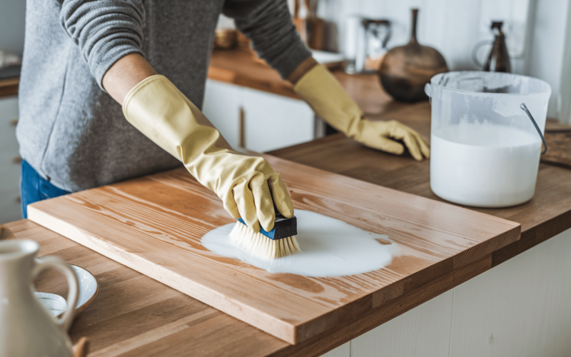
How to Apply Accessible Beige to Cabinets
Prep Work
Remove all doors, drawers, and hardware, labeling each piece for reassembly.
Clean surfaces thoroughly with a degreaser, then lightly sand with 220-grit sandpaper to create a proper bonding surface.
Apply a quality primer and allow it to dry completely.
Painting Process
Stir (don’t shake) your Sherwin-Williams Accessible Beige paint thoroughly.
Apply using brushes for detailed areas and foam rollers for flat surfaces.
Two coats are typically needed, with 4-6 hours of drying time between applications.
For best durability, allow 24 hours between coats.
Finishing
Let cabinets cure fully for 24-48 hours before reinstalling hardware and doors. Treat them gently for the first week.
For optimal results, choose Sherwin-Williams ProClassic or Emerald Urethane Trim Enamel in satin or semi-gloss finish, as these formulations withstand kitchen conditions well.
Conclusion
Accessible Beige offers a balanced option for kitchen cabinets that works across many design styles.
Its mix of beige warmth with gray undertones gives it staying power while remaining current. Before making your decision, get a sample and test it in your actual kitchen at different times of day.
Please pay attention to how it looks with your existing flooring, countertops, and lighting.
Consider your long-term plans for the space and whether you want a subtle backdrop or something more distinct.
Accessible Beige remains a solid choice for homeowners seeking a kitchen color that bridges classic and current design.