


The reign of gray in interior design is ending, and a new era of color is dawning.
Many homeowners and designers agree it’s time to refresh our spaces with warmer, more inviting hues.
We promise to unveil the exciting colors that are stepping into the spotlight, offering a fresh perspective on neutral palettes.
In this post, we’ll explore the shades replacing popular brands’ gray colors, such as Sherwin Williams’ gray shades, from different brands’ soothing sandy beiges to calming light blues.
You’ll discover how these new neutrals can transform your home, creating timeless and contemporary spaces.
Whether you’re looking to update a single room or revamp your living space, we’ll guide you through the colors, breathing new life into modern interiors and helping you create a fresh and inviting home.
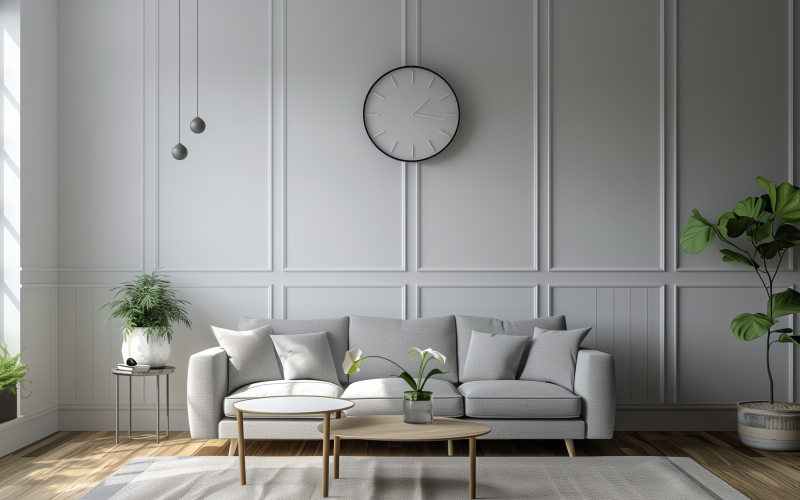
Beige is the New Gray
Beige is making a strong comeback in interior design, offering a warm and inviting alternative to gray’s cool tones.
This versatile hue brings calm and sophistication to any space, making it ideal for updating homes.
Beige offers unparalleled versatility and warmth, creating a welcoming atmosphere in various rooms.
Its subtle tones provide an elegant backdrop that complements various design styles, from modern to traditional.
Unlike gray, beige adds a touch of coziness while maintaining a neutral palette.
One of beige’s greatest strengths is its ability to serve as a perfect canvas for colorful accents.
It allows bold furnishings and artwork to shine without overwhelming the space.
This flexibility makes beige an excellent choice for those who enjoy changing their decor seasonally or experimenting with different color schemes.
Practical Applications
Beige works well in various rooms throughout the home.
In living rooms, it creates a relaxing atmosphere perfect for unwinding after a long day.
Bedrooms benefit from beige’s soothing qualities, promoting restfulness and tranquility.
Even kitchens can be transformed with beige tones, offering a clean and timeless look.
This versatile color pairs beautifully with natural materials like wood and rattan, enhancing a space’s organic feel.
Combining beige with these elements creates a harmonious, balanced interior that feels fresh and timeless.
Beyond Beige: Other Prominent Colors
1. Light Blue: A Fresh and Serene Choice
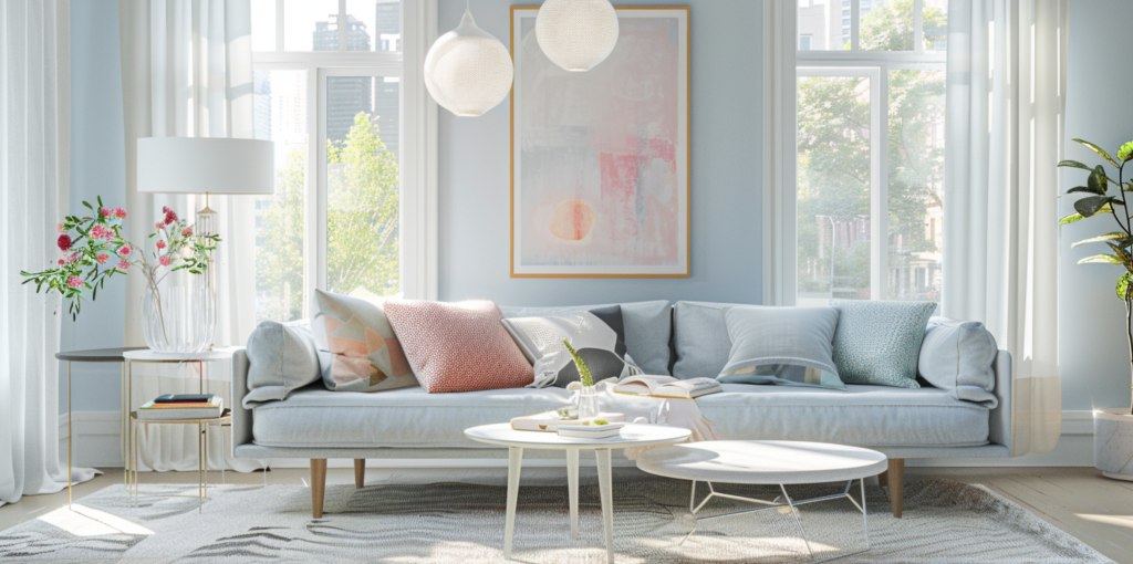
Light blue is emerging as a popular alternative to gray, bringing a fresh and calming presence to interior spaces.
This soft hue connects to nature, evoking clear skies and tranquil waters.
Light blue introduces a sense of serenity and spaciousness to any room.
Its association with coastal themes makes it particularly appealing for those seeking a relaxed, vacation-like atmosphere in their homes.
Unlike the coolness of gray, light blue adds a gentle touch of color that can brighten a room without being too bold.
It’s an excellent choice for creating a peaceful environment that still feels lively and engaging.
Usage Tips
For a cohesive look, consider using light blue in a monochromatic scheme.
This can involve varying shades of blue from pale to mid-tones, creating depth and interest while maintaining a calm overall feel.
Light blue also pairs well with other neutrals. It can be combined with warm beiges or crisp whites for a balanced, fresh look.
Consider pairing light blue with deeper navy accents or natural wood tones for a more striking contrast. When using light blue, pay attention to lighting.
This color can change significantly depending on the room’s amount and type of light. It appears more vibrant in natural daylight and softer under artificial lighting.
2. Plaster Pink: Warm and Inviting
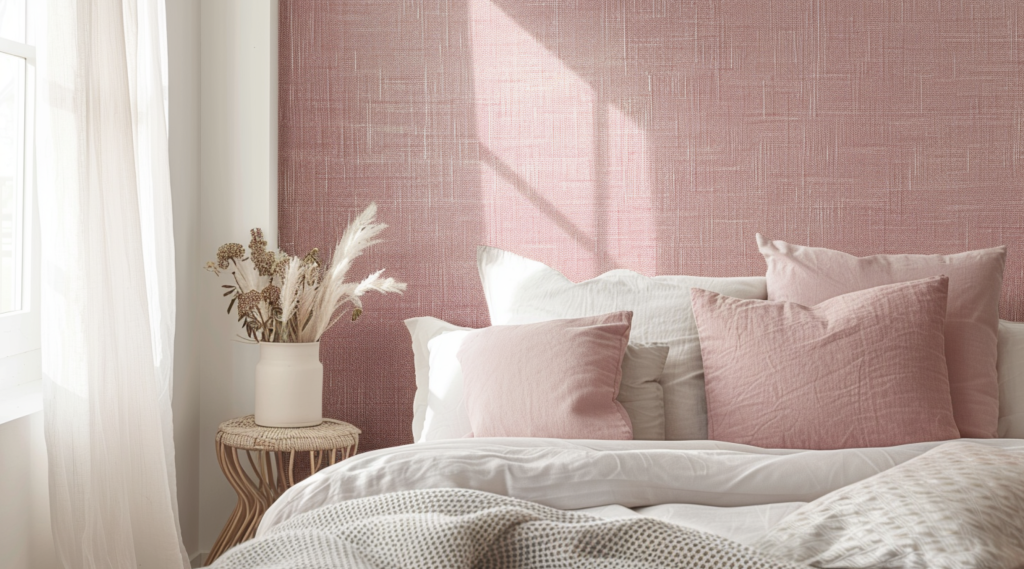
Plaster pink is gaining popularity as a sophisticated alternative to traditional neutrals.
This soft, muted shade adds warmth and subtle vibrancy to spaces, creating an inviting atmosphere.
It’s particularly well-suited for living rooms and bedrooms, where it can create a cozy yet refined ambiance.
Decoration Ideas
Incorporate plaster pink through soft furnishings like cushions and throws, or make a statement with pink wall paint.
For a subtle touch, use pink accents in artwork or decorative objects.
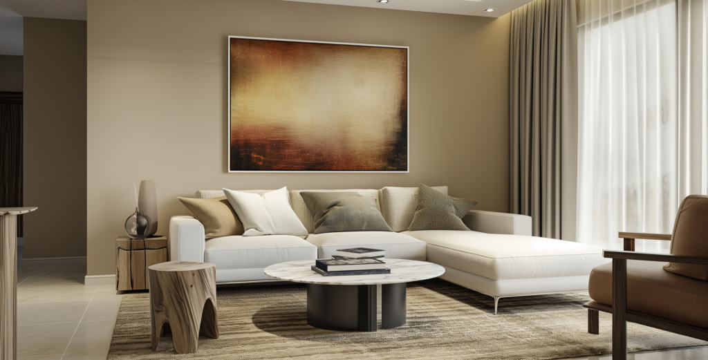
3. Caramel and Soft Cream: Cozy and Inviting
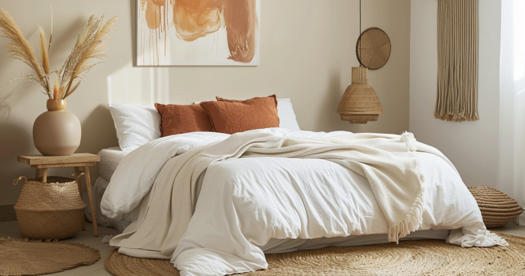
Caramel and soft cream tones are popular for those seeking warmth and comfort in their spaces.
These hues work well across various design elements, from walls to furniture.
Interior design experts highlight these colors for their ability to create a cozy and homely feel.
They provide a warm backdrop to make spaces feel more welcoming and lived-in.
Application Suggestions
Use caramel and soft cream in upholstery for a luxurious feel or as wall paint for an enveloping warmth.
These colors also work well in décor accessories like vases, picture frames, or rugs.
4. Muted Greens and Warm Whites: Nature-Inspired Choices
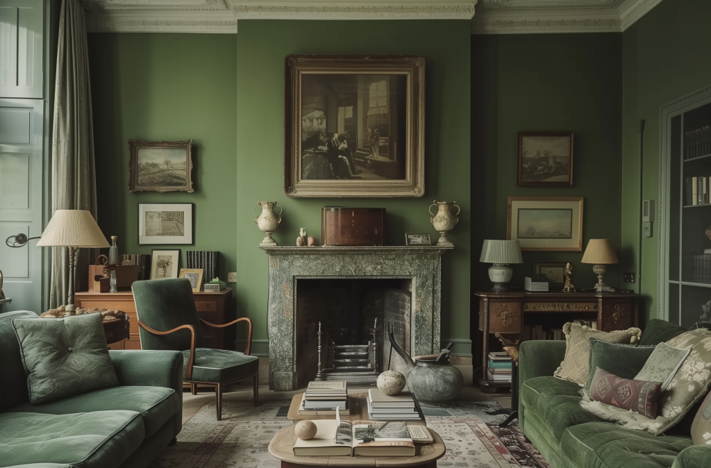
Muted greens and warm whites are gaining traction for their ability to evoke nature and freshness indoors.
These colors create a tranquil and refreshing ambiance, bringing a sense of the outdoors inside.
Designers are turning to these colors for their calming and therapeutic qualities.
They can help create energizing and relaxing spaces, perfect for today’s multi-functional homes.
Usage Tips
These colors are ideal for bedrooms, where they can promote restfulness.
They can create a spa-like atmosphere in bathrooms and a fresh, airy feel in living areas.
Use muted green as an accent wall color or in textiles paired with warm whites for balance.
Conclusion
Moving beyond the gray era, a new spectrum of warm and inviting colors transforms interior design.
Beige, light blue, and plaster pink lead the charge, offering fresh ways to revitalize our living spaces.
These versatile hues create cozy living rooms, tranquil bedrooms, and refreshing kitchens, providing endless possibilities for personalization.
The key to successful design is choosing colors that resonate with you and complement your lifestyle.
As you explore these trending shades, consider how they can reflect your style and enhance your daily life.
Why not start small? Incorporate these colors through accessories or an accent wall.
Your journey towards a more vibrant and welcoming home begins with a single brush stroke.
Ready to embrace change? Let these new neutrals inspire you to create a space that feels like home.