


When choosing colors for your design or outfit, you might wonder whether maroon leans more toward red or purple.
This question often arises because maroon can appear to have qualities of both colors.
Luckily, by understanding maroon’s unique characteristics and color theory, you can confidently determine its position on the color spectrum and pick the best colors with maroon.
In this article, we’ll explore the maroon color, its origins, composition, and perception to answer the question: Is it closer to red or purple?
We’ll also discuss maroon’s usage in various contexts and provide helpful tips for distinguishing it from similar shades like burgundy.
By the end, you’ll clearly understand this rich, versatile color and how to use it effectively.
Technical Analysis of Maroon
Some color experts position maroon closer to red than purple, citing its predominantly reddish appearance.
Others argue that maroons sit precisely between red and purple due to their equal red and purple composition—some place maroon slightly closer to purple, emphasizing its subtle purple undertones.
Let’s examine how various standard color references define this shade to understand better whether maroon is closer to red or purple.
Pantone Description
Pantone, a widely used color-matching system, describes maroon as a dark red with hints of brown and purple.
HTML/CSS Color Code
In the HTML/CSS color system used for web design, maroon is represented by the hex code #800000, which translates to an RGB value of 128, 0, 0.
RGB Color Model
The RGB (Red, Green, Blue) color model creates colors by mixing different amounts of red, green, and blue light.
Maroon’s RGB values provide insight into its composition. With a red value of 128, maroon displays a darker, less saturated red than pure bright red (255, 0, 0).
The absence of green and blue values indicates no mixing with those colors.
Notably, the maroon’s red value of 128 is exactly halfway between pure red and purple (128, 0, 128), suggesting that it contains equal parts red and purple based on the RGB scale.
CMYK Color Model
In the CMYK (Cyan, Magenta, Yellow, Black) color model used for printing, maroon typically contains no cyan, 100% magenta, 60-80% yellow, and 40-70% black.
The high magenta content contributes to the maroon’s reddish appearance, while the substantial yellow and black create darker, brownish undertones.
Color Wheel Analysis
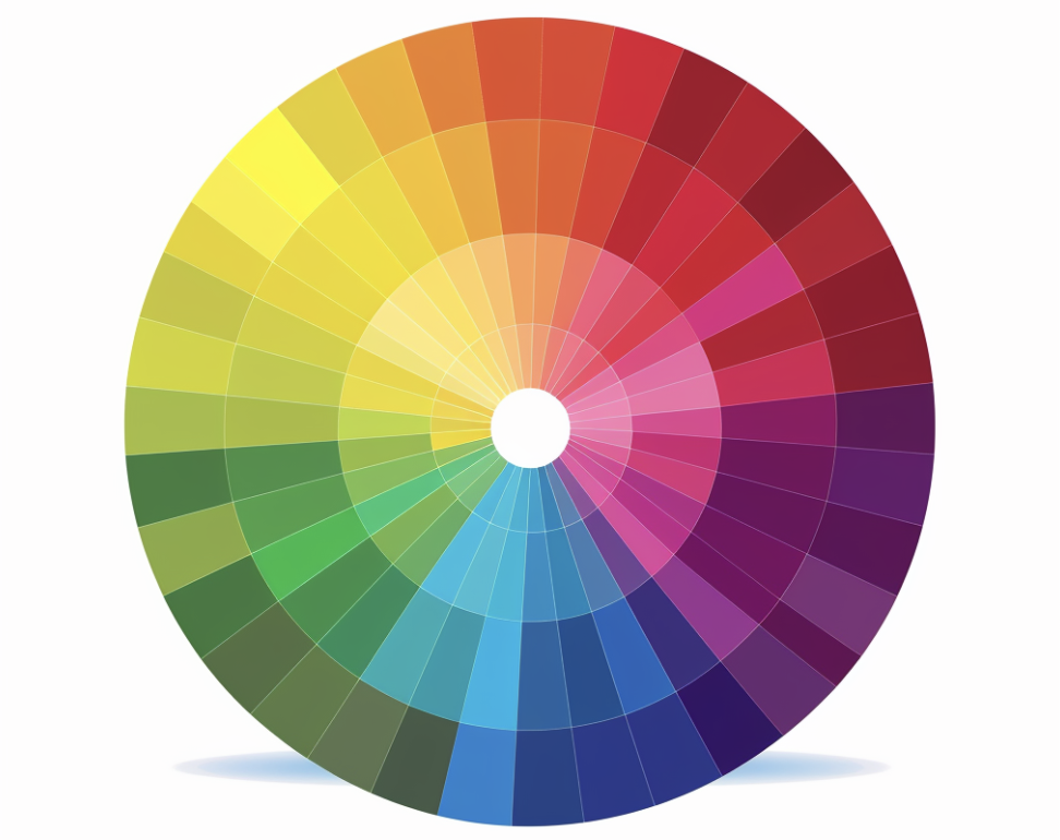
Maroon is a tertiary color created by mixing red (a primary color) with purple (a secondary color). This means maroon inherits qualities from both its parent colors.
The exact placement of maroon on the color wheel can vary slightly depending on the specific shade and the color model used.
Difference in Human Perception
While technical analysis provides insights into maroons’ color composition, human perception also plays a significant role in how maroons are experienced and interpreted.
Several factors, including the following, can influence our perception of maroons.
- Surrounding colors: Maroon may appear more red or purple depending on the colors it is paired with or placed against.
- Lighting conditions: Different light sources can emphasize or subdue maroon’s red or purple tones. Warm lighting may bring out its reddish hues, while cool lighting can highlight its purple undertones.
- Personal color perception: Individual differences in color vision and sensitivity can affect how one perceives maroon. Some people may be more attuned to its purple tones, while others may see it as predominantly red.
Cultural Context of Maroons
In ancient times, maroon pigments were derived from rare and expensive sources, giving the color an air of luxury and prestige.
In Western universities, maroon is often used in academic robes and school colors, linking it to tradition and scholarship.
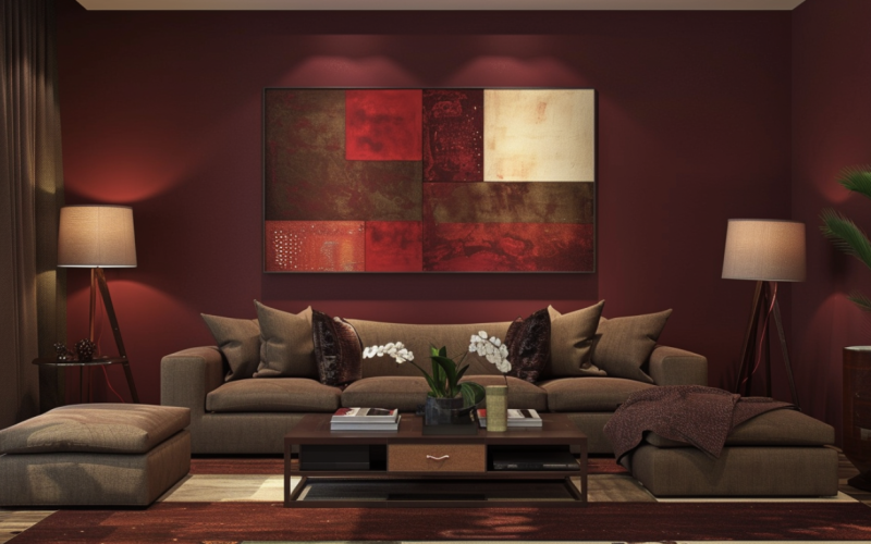
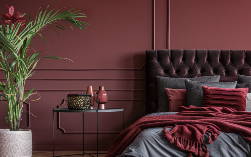
In contemporary design and fashion, maroon is frequently used to convey sophistication, warmth, and elegance.
It is a popular choice for autumn and winter palettes and interior design, where it is used to create cozy, inviting spaces.
Maroon has also been associated with various cultural and political movements. In some contexts, it has been used to symbolize leftist and anti-fascist activism.
These diverse cultural associations demonstrate maroon’s versatility and ability to evoke different emotions and meanings depending on the context in which it is used.
Comparison with Similar Colors: Burgundy and Others
Maroon is often confused with deep, reddish shades like burgundy, wine, or oxblood. While these colors share some similarities, they have distinct differences.
Burgundy, for instance, is a dark red color with more pronounced purple undertones than maroon.
It is named after the Burgundy wine region in France and often evokes associations of luxury, sophistication, and elegance.
Burgundy’s hex code is #800020, which indicates a higher blue value than maroon (#800000), contributing to its purplish tint.
Other similar shades include the following.
- Wine: A deep, dark red color reminiscent of red wine, often with a slightly bluish or purplish tint.
- Oxblood: A very dark, brownish-red color that resembles the color of dried blood.
- Cranberry: A deep red color with a slightly pinkish or purplish hue, named after the cranberry fruit.
Conclusion
By examining maroon’s technical properties, position on the color wheel, and cultural context, we can better understand its unique qualities and how it is perceived.
While experts may debate maroon’s exact classification, its versatility as a color that combines the warmth of red with the depth of purple is undeniable.
Whether you’re a designer looking to create a sophisticated palette or simply someone drawn to this rich, evocative hue, understanding maroon’s complexities can help you appreciate its beauty and make informed choices.
So the next time you’re considering colors that go with maroon, remember its special place between two worlds – and let your creativity shine.
Embrace the power of maroon in your designs and beyond!